Maps should be used in moderation
says Friedrich Lindenberg – and he is right. It is tempting to use maps for all kinds of visualizations, but there a quite a lot of pitfalls (a classic one: your data actually relates to the number of people living in a certain area, not the size of that area).
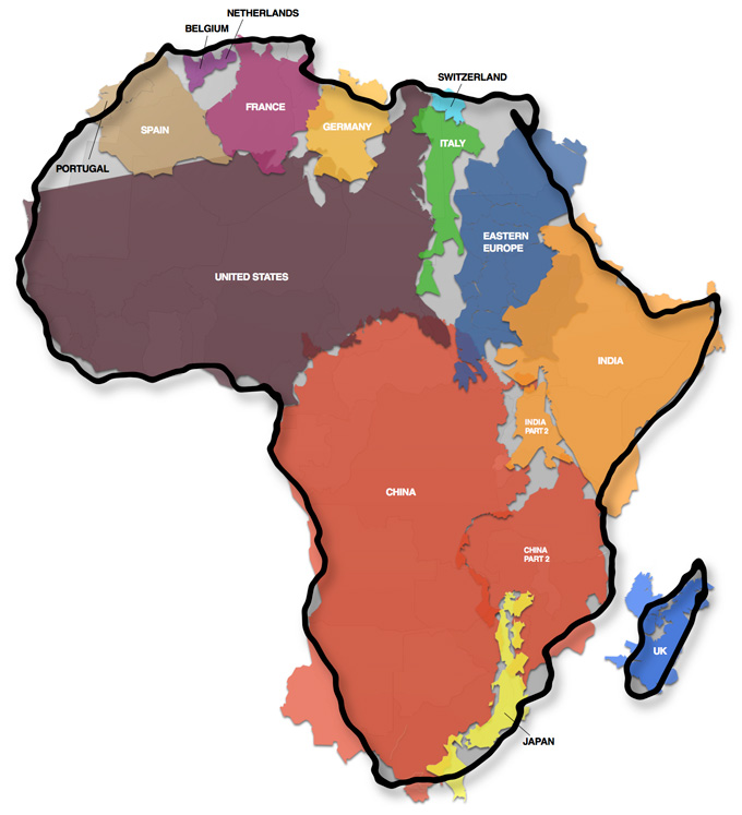
One aspect for maps relating to the size of countries (or continents) that has to be considered is the choice of the projection. The definitive must-see in this field is The True Size of Africa.
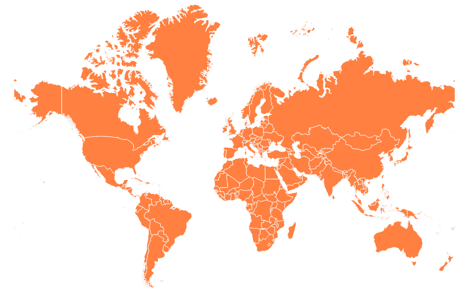
Compare that with the classic Mercator projection (as used in Google Maps and also Infogr.am):
And see a Robinson projection for contrast. The size of Greenland is almost as stunning as Africa.
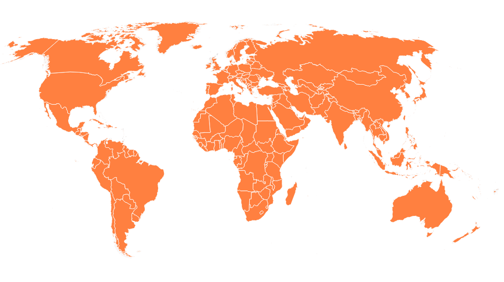
Screenshots for projections from Mapstarter.